
Xanadu
Project Category: Logo Design
Created For: Xanadu Health Club Inc.
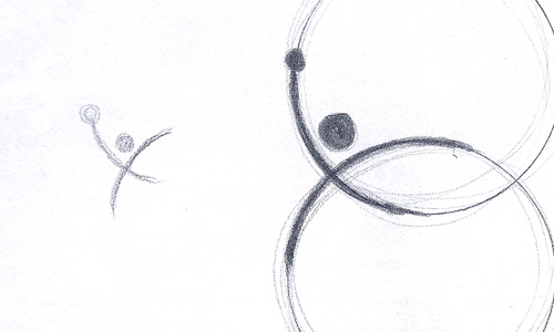
The Xanadu logo was created to excite, showing movement and activity. The name represents a modern-day Shangri-la, so it was fitting the the colouring chosen would use rich tones of royalty and gold. Numerous ideas were presented, but the one that resonated the most was the intersection of two ideas - body and mind, like two circular plains crossing paths.
The intersection of two circles became the inspiration for the logo and the character that was created out of that shape. Now utilized throughout the multi-million dollar, 35,000 sq ft. facility, the Xanadu trademark will find its home on clothing, cups, certificates and more. Feedback has been tremendous from members, peers and staff alike.

 Date In Mind
 SiteBubble
 Digital Elegance
 XAG Energy
 Xanadu
 Sunflower Network
 Walkerville Lofts
 GD Rock Drywall
 PowerTech
 The Mill
 Daryls
 Dekko
Dekko Flow
Flow Powertech
 Xanadu
Follow Us